OUR STORY
-
Fyrian (verb)
Pronounced |[feer-ree-ehn]
Definition: “to supply with fire”
Origin: Old English. c.1400
Fyrian was born in Sydney, Australia in 2019. The concept for Fyrian was seeded years earlier when the founder, Daniel, recognised that there wasn't a high-quality range of candles available for men. Furthermore, not all personal tastes are drawn to the delicate glassware seen in many candle ranges.
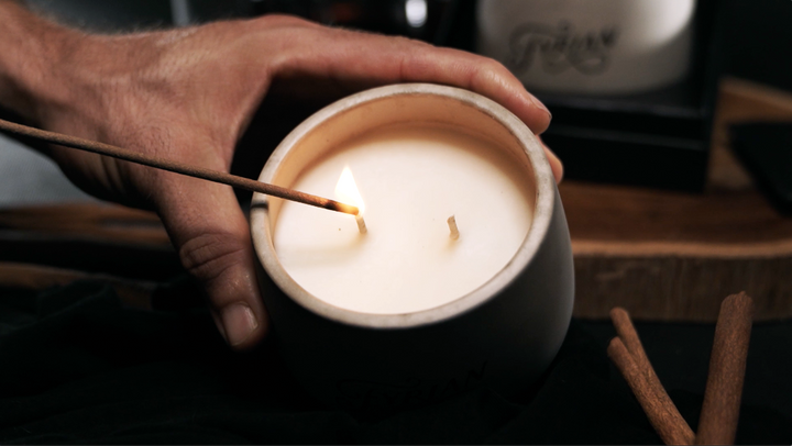
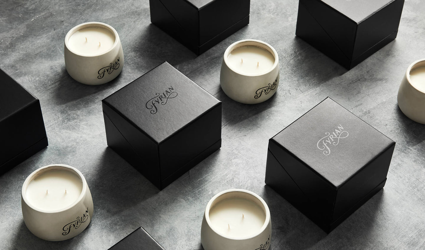
Fyrian candles are intentionally masculine, bold and minimal in design. An original creation, every aspect of our candle range is unique and considered. For example, the greater width of the vessel means more wax surface area and therefore maximum 'scent throw'. The double wick helps achieve an even burn across the surface of the wax and prevent 'tunneling'. The matte black packaging is sharp and angular, it opens up in a way that beautifully showcases the vessel perched inside, creating an unforgettable unboxing experience.
The Fyrian logo, showcased below, started out as a completely hand drawn sketch and evolved into the shape it takes today. It subtly expresses a wispy plume of smoke rising off an extinguished flame. You'll find the logo perched atop our custom matte black packaging, which has been designed to perfectly fit the vessel and create an incredible unboxing experience.
In the physical creation process of Fyrian candles, each concrete vessel is carefully hand poured, one by one. Once the vessel takes shape an inscribed Fyrian logo is shaded-in by hand. From there, we add high-quality soy wax and combine it with incredible, unique scents, which means a clean burn with lasting aroma. All poured in Sydney, Australia.
To stay in touch with Fyrian and receive emails from time to time about new products and other exciting announcements, subscribe to our newsletter. If you're a publication or press member and would like to feature Fyrian, please see our dedicated section for press enquiries.
LOGO
The logo is a completely hand drawn concept and takes inspiration from smoke and fire to create the swirls around the letters 'F' & 'R'. They each represent a wispy plume of smoke rising off an extinguished flame. Classy yet strong.
AESTHETIC
The inspiration for the look and feel of the candle came from roaming the streets of Brooklyn. The chaotic beauty of an industrial, concrete backdrop met with the artistic finesse of graffiti on a wall.